
The intent here is to create a website background image that fills the browser window all the time. The details include:
- The page is filled with the image and zero white space
- The image can be scaled as needed
- Image proportions (aspect ratio) are retained
- The image is correctly centered on the page
- Image doesn’t cause scrollbars
- Compatible across browsers
- Doesn’t employ Flash or similar ‘tricks’
Simple Way with CSS3
CSS3 has a background-size property that will create the desired effect. It’s best to use the html element because it’s always the height of the browser window at a minimum. Set up a fixed, centered background. Adjust its size by using the background-size rule. Set it to the cover keyword. Like this:
html {
background: url(images/background.jpg) no-repeat center center fixed;
-webkit-background-size: cover;
-moz-background-size: cover;
-o-background-size: cover;
background-size: cover;
}
This works in:
- Safari 3+
- IE 9+
- Chrome Anything+
- Opera 10+
- Firefox 3.6+ (Firefox 4 supports only non-vendor prefixed version)
CSS Only – Method #1
This method makes use of an inline img element. This can be resized in any browser. First set a min-height to ensure it fills the browser window vertically, then set it to 100% width to ensure it fills the window horizontally.
Then set a min-width so that the image never gets smaller than its actual size. Use a media query to check the size of the browser window against the image size, then use a combination percentage-left and negative left margin to keep the image centered in all cases. Here’s an example:
img.background {
/* Set rules to fill background */
min-height: 100%;
min-width: 1024px;/* Set up proportionate scaling */
width: 100%;
height: auto;/* Set up positioning */
position: fixed;
top: 0;
left: 0;
}
@media screen and (max-width: 1024px) { /* Specific to this particular image */
img.background {
left: 50%;
margin-left: -512px; /* 50% */
}
}
This works in:
- Any version of Safari, Chrome, Opera, or Firefox
- Possibly IE6 if a fixed positioning shim is applied
- IE7 and IE8 mostly, but small sizes won’t center
- IE9 is fine
CSS Only – Method #2
An easy way to get the desired result is to place an inline image on the page, then fixed position it to the upper left of the screen. Apply a min-width and a min-height of 100% to preserve its aspect ratio. Here’s an example:

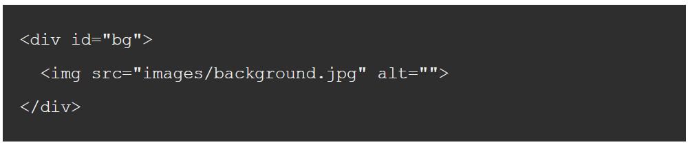
#bg {
position: fixed;
top: 0;
left: 0;/* Preserve aspet ratio */
min-width: 100%;
min-height: 100%;
}
The above fails to center the image, however, so this needs to be fixed by wrapping the image in a div. Make the div twice as large as the browser window. The image will end up with its aspect ratio intact and set squarely in the center of the window.
#bg {
  position: fixed;
  top: -50%;
  left: -50%;
  width: 200%;
  height: 200%;
}
#bg img {
  position: absolute;
  top: 0;
  left: 0;
  right: 0;
  bottom: 0;
  margin: auto;
  min-width: 50%;
  min-height: 50%;
}
This works in:
- Recent versions of Safari, Firefox, and Chrome
- Not in Opera or earlier versions of IE
- IE 8, 9, and 10 but note that if you add the image using JavaScript you’ll need to define the img as width: auto and height: auto
- When setting up for Android, include these in the html element: height: 100%, overflow: hidden, as shown here:
html {
  background: url(images/background.jpg) no-repeat center center fixed;
  background-size: cover;
  height: 100%;
  overflow: hidden;
}
jQuery Method
If you know the background image’s aspect ratio is bigger or smaller than the current browser’s aspect ratio it is even easier to manage. If smaller, set just the width of the image to 100%. The result is that the height and width will both be filled. If larger, you can get the same result by setting just the height to 100%. You can discover this information via JavaScript, using jQuery, as shown here:

#bg { position: fixed; top: 0; left: 0; }
.bgwidth { width: 100%; }
.bgheight { height: 100%; }
$(window).load(function() {
	var theWindow        = $(window),
	    $bg              = $("#bg"),
	    aspectRatio      = $bg.width() / $bg.height();
	function resizeBg() {
		if ( (theWindow.width() / theWindow.height()) < aspectRatio ) {
		    $bg
		    	.removeClass()
		    	.addClass('bgheight');
		} else {
		    $bg
		    	.removeClass()
		    	.addClass('bgwidth');
		}
	}
	theWindow.resize(resizeBg).trigger("resize");
});
While this doesn’t handle the centering, it’s not hard to make the necessary changes to handle that.
This works in:
- IE7+
- Most desktop browsers
Note that you should make the image size appropriate to the screen. Avoid loading a huge image for a tiny screen, for example. To do this, make images and name them by size, such as 1024.jpg, 1280.jpg, etc. Then load a shim instead of loading the img. Here’s an example:
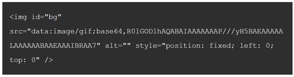
If you prefer not to use the gif shim, load one of the real images instead. Then check the width of the screen and set the image’s src based on the result. The example below does that on resize:
(function() {
var win = $(window);
win.resize(function() {
    var win_w = win.width(),
        win_h = win.height(),
        $bg    = $("#bg");
    // Load narrowest background image based on
    // viewport width, but never load anything narrower
    // that what's already loaded if anything.
    var available = [
      1024, 1280, 1366,
      1400, 1680, 1920,
      2560, 3840, 4860
    ];
    var current = $bg.attr('src').match(/([0-9]+)/) ? RegExp.$1 : null;
    if (!current || ((current < win_w) && (current < available[available.length - 1]))) {
      var chosen = available[available.length - 1];
      for (var i=0; i<available.length; i++) { if (available[i] >= win_w) {
          chosen = available[i];
          break;
        }
      }
      // Set the new image
      $bg.attr('src', '/img/bg/' + chosen + '.jpg');
      // for testing...
      // console.log('Chosen background: ' + chosen);
    }
    // Determine whether width or height should be 100%
    if ((win_w / win_h) < ($bg.width() / $bg.height())) {
      $bg.css({height: '100%', width: 'auto'});
    } else {
      $bg.css({width: '100%', height: 'auto'});
    }
  }).resize();
})(jQuery);
While screen width is useful, there is other information you might want to gather before choosing a screen size. You might want to experiment with different data when setting up your rules.
Thanks for stopping by and please take a look at some of my guides to the best Australian web hosting.