
Disclosure: Aussie Hosting is community run. We sometimes earn a commission when you buy hosting through our links. Learn more.
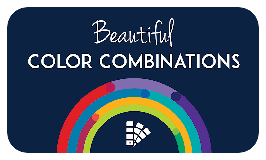
Website Color Scheme Guide
 Nathan Finch——Last Updated on March 10, 2025
![]()
![]()
![]()
![]()
![]()
![]()
 You may have much luck proving that colors are for specific emotions as proving Tarot card readings: Green may bring up nature for one person. Another sees the green of envy, or a morning smoothie.
Colors matter by adding to a bigger picture. Visitors want (and NEED) stories that make sense.
The best stories are usually simple, or they boil down something complex in a much simpler way.
People easily fit it into their reality, even at a glance. As humans relate to the world via stories, visitors will subconsciously look at you and your offerings this way: “What the hell is this? Is it important? Is it interesting..?” Color helps to establish this proper context, as well as attracting the eye:
★ Dark vs light
★ Playful vs serious
★ Natural vs chaotic
★ Age/gender specific vs general
Bottom line: get your story straight first, then get to painting your site.
Table of Contents
- Using Color for Storytelling


- 5 Stunning 2025 Website Color Ideas
- Quick Guide to Basic Colour Theory
- Summary
How to Use Color for Storytelling
 For website colour trends in 2025, click here. First, let’s talk about how colors work in general, to sell ANY story:
Q1. What are you about?
- The eclectic, unpredictable and crazy
- Bros with cars, guitars and picks
- Trusted accounting software
- “Emm…ah...I-um”
Hemming and hawing? You should know what you’re about before continuing. So, if you’re unsure, it’s worth spending time working this out—from there, you’ll have a natural instinct on where to go next with colours—without this, any color guide will be ultimately useless.
Answering these questions can help you to determine what colour you want to associate the most with your brand, for example for your logo.
Q2. How are colors usually used?
Colours get associated with certain things more often than with others.
Here are some examples :
- RED with high energy, danger or blood
- EARTHY colors with ruggedness and the idyllic
- BLUE for the sky, ocean or travel
- YELLOW with joy, flowers and youth
- DARKNESS for the mystery or the hidden
Q3. Are you overthinking?
Don’t. This can all change in an instant. Orange could mean a thousand things, from sunshine to nostalgia. It all depends on the context.
You should already have a good instinct on things, enough for entry-level website building.
You can also treat colors the way they usually are, or do the opposite and use colors in an uncommon way, to create an unexpected emotion:
Q4. What do you see below?

- Depth (deep-blues)
- Anticipation (bright-reds)
- Dawn (orange)
Or does this image look like a ‘perfect union’ of all the above. (If you guessed that, bingo. This is the final scene in Disney’s Moana movie—a perfect union of those colors, showing emotions unified, as the plot is resolved).
5 Website Colours Trends in 2025
Now that we’ve looked at some of the ways colours can be used to tell stories, let’s get into specific examples that are popular today.
Remember, it’s more important to tell your story than to imitate any trend—knowing who you are will be way more important and useful for longevity and reliability:
1. Divine Darkness
Website color schemes: dark

Source: Apple
Colours: #131313 (black), #2B2B2B (lighter black), #86868B (grey), and #1561f0 (blue)
Simple truths are often the most lasting. Using this dark colour colour scheme therefore can be superb for minimalistic websites.
Websites that use sparse words look clean and organised with it. The title of this colour scheme ‘divine darkness’ because it suggests to the visitor that the product is elegant and densely packed with value.
This is a fantastic colour scheme particularly for information-based products. Use one or two extra colours, to contrast the headline and subheadings.
2. Complementary Colors on White
Website color schemes: white
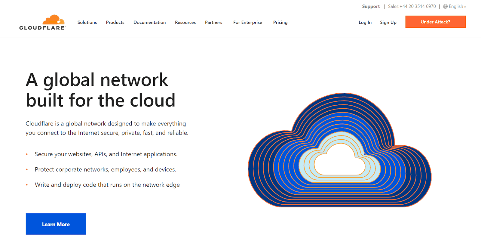
Source: Cloudflare
Colours: #FFFFFF (white), #D66680B (orange), #0054DC (blue), and #424242 (dark grey)
Divine darkness is one side of the coin, working in a similar way to its inversion, white.
Darkness goes hand-in-hand with the image of competency via a deep skill, or having some high-value and exclusive product.
But you can combine complimentary colours against a white background, for a more generally useful product. White can be spacious (we call it “neutral” but it’s actually brightly meaningful).
You can use blue, to pack-on reliability and trust associations. Orange adds a touch of energy and excitement to the logo and graphic—Cloudflare chose this for their brand logo as a nod and wink to sunshine and clouds.
This works well as a blogging platform color scheme.
3. Cherry-Red Beauty
Website color schemes: red
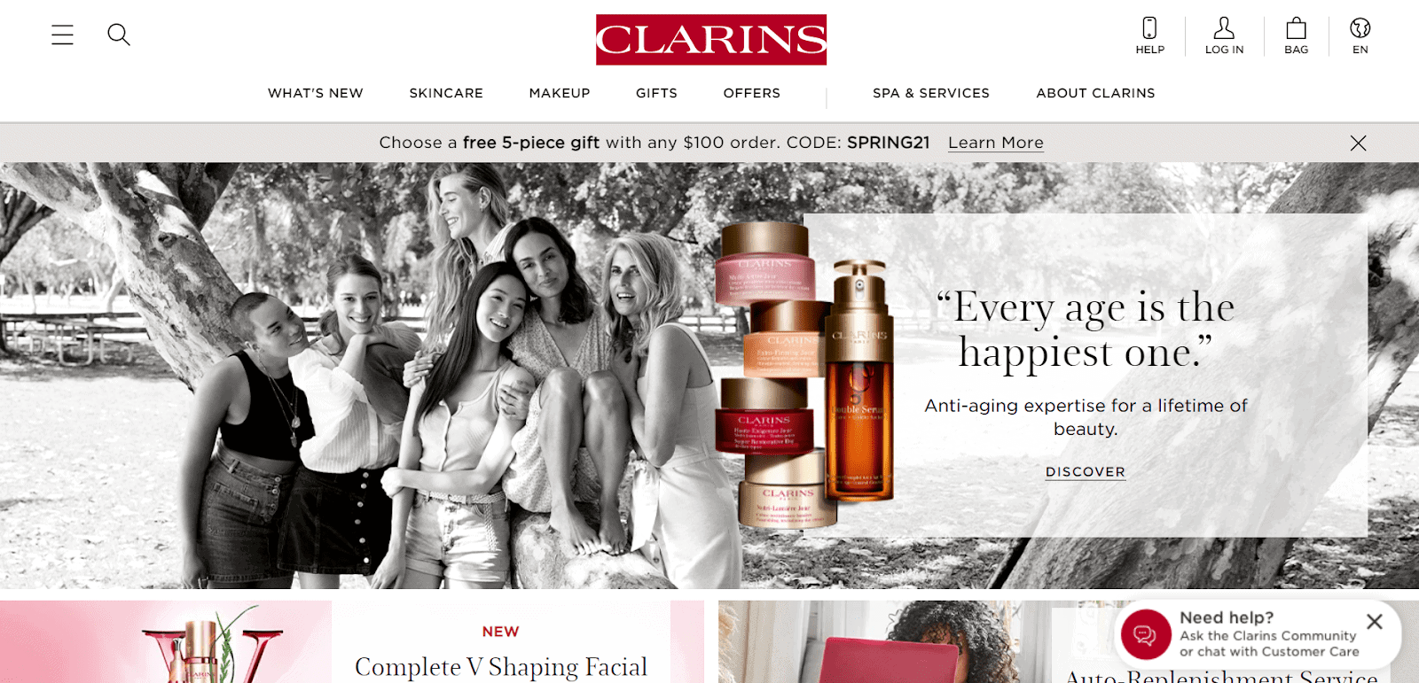
Source: Clarins
Colours: #BE0F34 (cherry red), #F3A1AF (pink), #FFFFFF (white), and #E5E5E5 (light grey)
Cherry red looks feminine in a striking way when pitted against ambient hues and white.
Compared to the ambient pink, it’s bolder, helping to highlight the brand name. There’s a divine impression from the airy white, cooler pastels and grayscales.
Overall recommended for everyday pampering ecommerce items and services, things to do with self-care, beauty and femininity. Previously, they used #DCE5F4 (baby blue) with greens, for a ‘nature product’ look.
4. Enterprise Solutions
Website color schemes: blue

Source: Lucas Group
Colours: #1E6BA2 (calming blue), #FFFFFF (white), and #68757B (settled grey)
When you go with Clarins’ beauty products (see the #3 example above), you’ll strike up attention. This would also be desirable for their customers.
Not the case if you are dealing with enterprise or business issues, such as human resources. Here, you want something trustworthy and steady, not something that will generate sudden attention.
Lucas group has, therefore, gone with a neutral grey, suggesting competency, while the colour blue is used to indicate reliability. This is the colour of the constant, clear sky. If you have any CTAs, feel free to use orange (#BE8B09).
5. Magical Grape
Website color schemes: purple / grape-purple
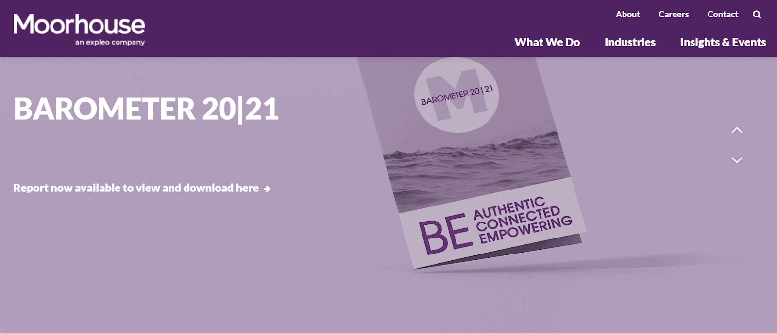
Source: Moorhouse Consulting
Colours: #1E6BA2 (calming blue), #FFFFFF (white), and #68757B (settled grey)
Purple has an interesting history: in ancient times, it was the most expensive and treasured color dye, used by priests, royals, and wealthy elites.
To this day, it is used as the official colour of the church, symbolising Advent and Lent during Easter. Naturally, it makes a good colour in the modern day for small, curated, or consulting businesses.
Using purple can suggest that you serve a small “elites” of customers in a magical, transformative way.
If you are starting an online business that fits this description, this color scheme may be the perfect fit.
Simple Guide to Colour Theory
Have a look at this color wheel:
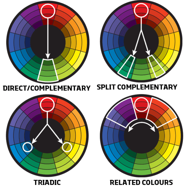
Complementary Colors
Complimentary colours use two hues that are directly opposite each other on the color wheel (see above).
Using only two complimentary colours trace the highest amount of visual contrast, such as black versus white. It’s also the easiest way to create color harmony.
You can also use a ‘split complementary’ pattern, which allows more colour variation without destroying this harmony. Most people you have heard of colour theory associate this with complementary patterns.
Triadic Colors
This is where 3 colours that are equidistant in the colour wheel are used.
This creates a more complicated impression, as each color is far away from the other as it can be. It’s useful for striking visual contrasts, as opposed to calm and harmonic.
Related or Analogous Colors
Where each mood colour is next at the other in the colour wheel. This leads to a very visually soothing composition, creating a more homogenous sense of harmony.
Be careful here, as it can be a bit stuffy or dull.
Summary ⭐
We hope this guide was useful, the hope was to keep things down-to-earth. In the grand scheme, colours probably won’t make or break you.
If you know your story, and tell it correctly via your graphical and textual usage, the proper colors will naturally follow, particularly for your brand logo.
There’s no need to be an expert designer.
To avoid confusing visitors: white or black carry minimalist appeals (black for specialist exclusivity and white for generality). These are the safest bets to make, wherein you can scatter different additional colours to make your brand name and other aspects stand out.